Process Map
The Process Map visualizes any business process or multi-step task and provides an end to end model encompassing each step of the process. The map automatically generates an understanding of the as-is process and identifies process bottlenecks, activity hotspots, step and cycle times and blockers to getting work done. Pyze users can drill into each specific step of the process or any sub processes to optimize workflows, identify inefficiencies and UX issues.
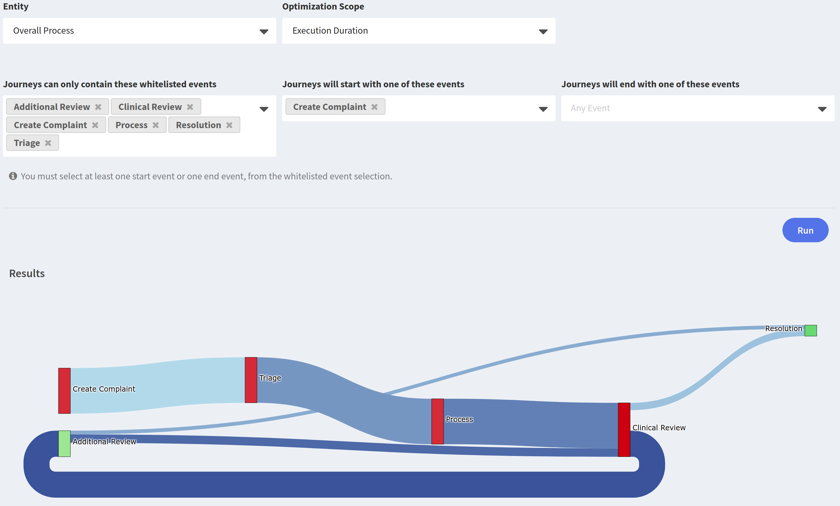
Setting Up the Process Map
First, choose the Business Entity to Analyze. By default, all applications include the User entity, and depending on the application platform other default entities may be automatically created. An entity represents a business process and can be quickly provisioned by your customer success manager.
Second, choose the Optimization Scope. This feature sets the optimization dimension used to evaluate process node performance. By default each node will be colored from red to green based on Execution Duration scope. Depending on the data available to Pyze, several other optimization scopes can be enabled. For instance, if Pyze has access to employee pay band information, the Cost Optimization scope can evaluate the cost of executing the overall process, steps in each process and the relative cost of different workflows.
Next choose the list of Business Events to include in the Process Map and set one or many start and/or end events to anchor the visualization. The resulting diagram displays a map of the process based on the events chosen.
Understanding the Process Map
The Process Map will dynamically generate the various workflows that begin or terminate at the selected Business Events.
Activity Hotspots
The deeper the hue of the blue along the lines, the more user activity on that path.
Time Between Nodes
Each Path between Nodes shows the number of actions entering and exiting that path as well as the step time between the two activities.
Node Color
Each node is colored based on the optimization scope. You can click into each node to get Node details, showing relevant segmentation and business metrics for that node below the visualization.